Search the Community
Showing results for tags 'issue'.
Found 6 results
-

2.0 Readability and usability of the new UI list panels
Олег Поленин posted a topic in Technical Support
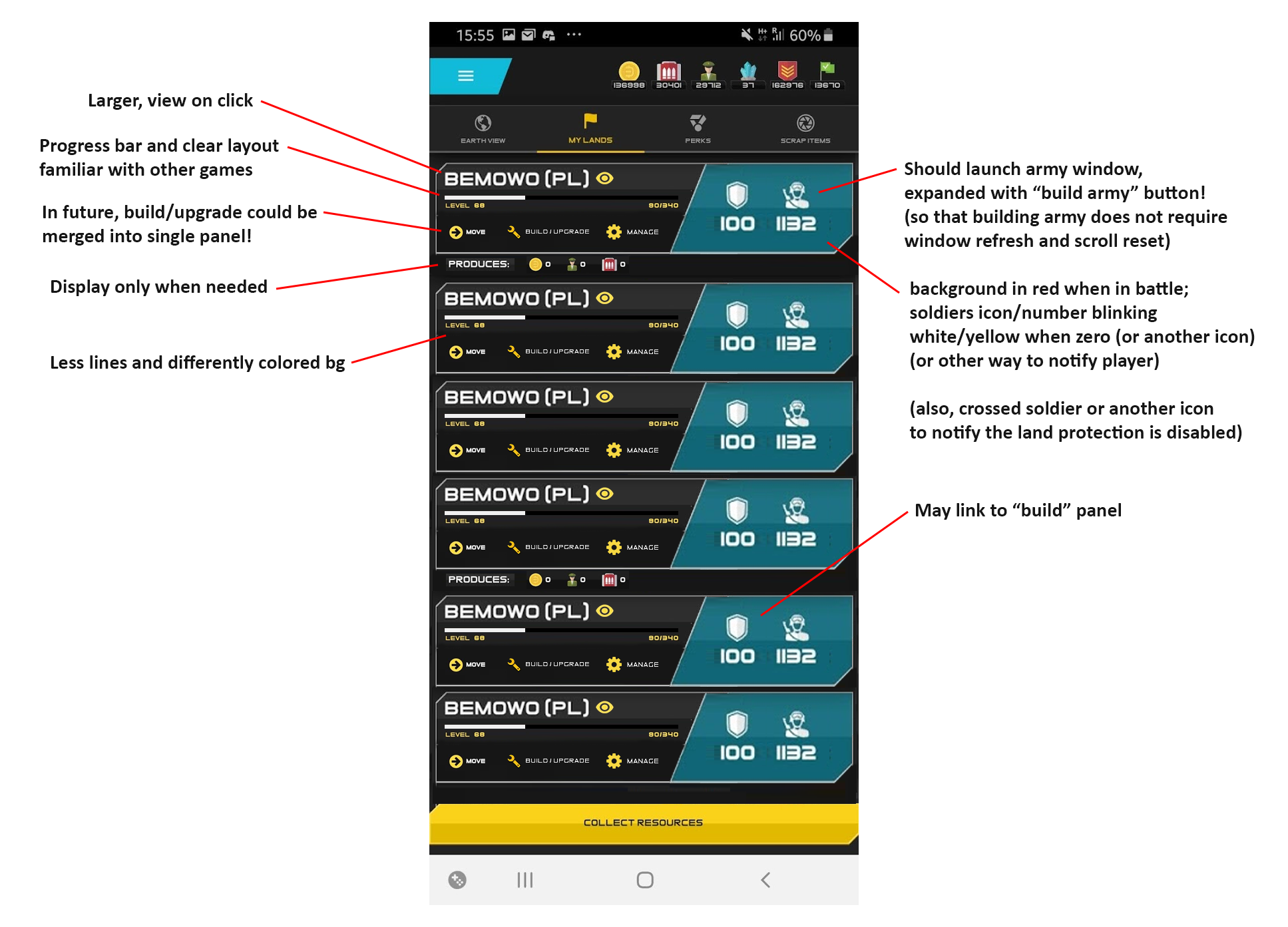
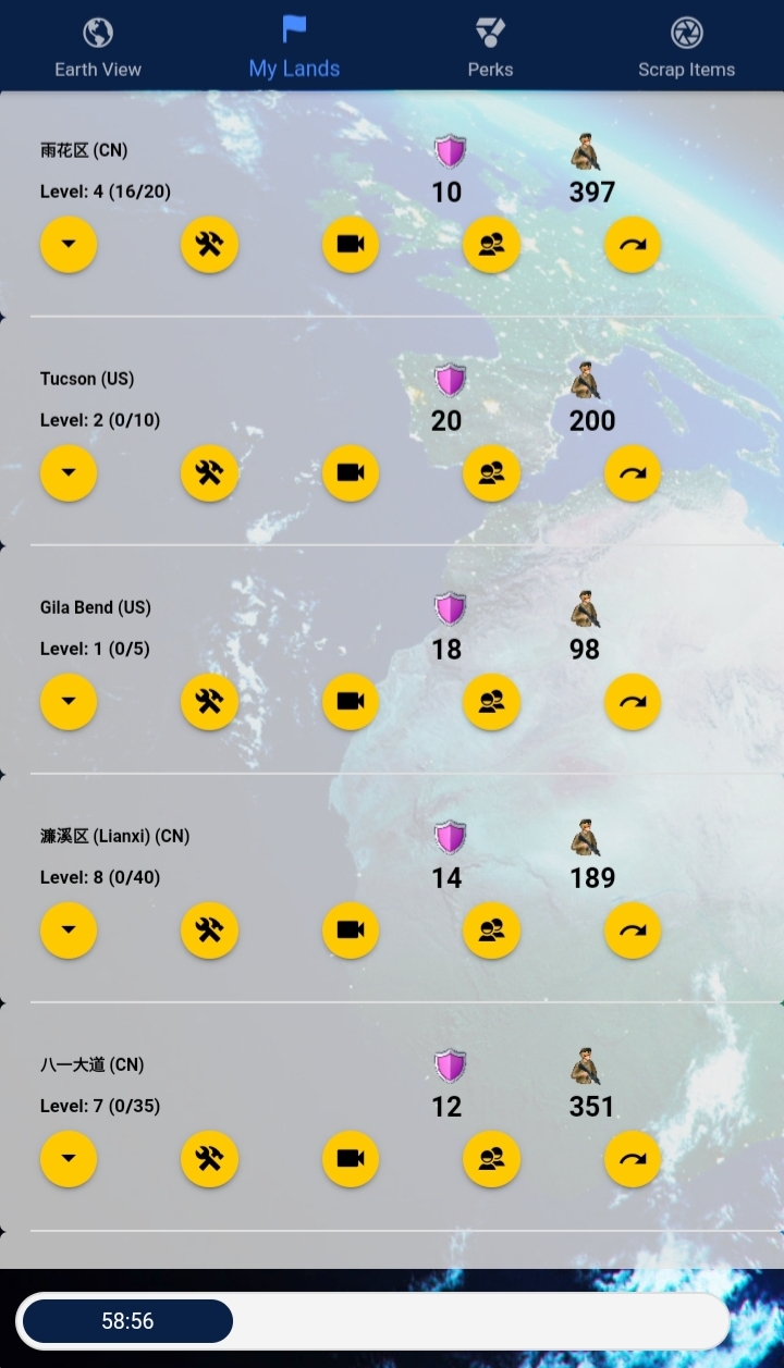
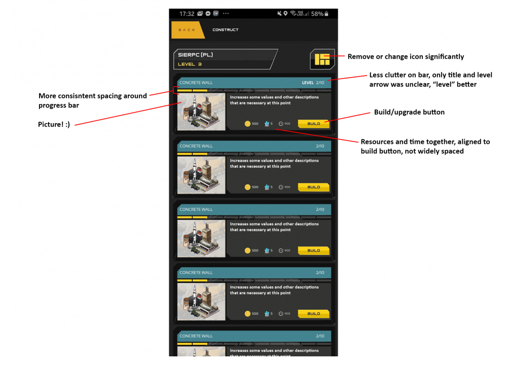
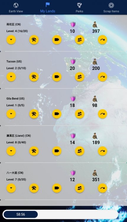
There are several panels in game that show information about a list of objects. The 2.0 update brought several updates to these panels, some of which improved the experience, while others, especially the graphic style, decreased their readability and usability. I'll make a general comment first and then will jump to specific panels directly: General comment There are two concepts introduced in new UI that, together, dramatically decrease the readability of various screens: the extreme use of various frames, borders, varying backgrounds, the ui paradigm further moving away from a tabelar/grid layout towards a chain of specialised UI boxes. These two together make it harder to find specific informations, or to quickly review them in a batch. I'll show exact examples below with change suggestions: My lands screen What was a single row of actions has now been split into two lines. It made the list longer and otherwise very cluttered. The middle row wastes a lot of space, and yet the icons feel kind of hidden, unimportant, or not even a button. It's now very hard to read through all the bases to inspect if they are not lacking in soldiers. The base name is lost in the clutter, due to the size and new font. The "produces" row: for 95% of gamers, or even more, this row will always show 0 on theirmain base and 99,99% it will show 0 on all bases that are not currently played in. It was far beter before, when it only showed values when they really existed. Suggestions: Messages screen Not much changed, but suggestions: time in same row as title, right-aligned (better position to compare and focus eye on in grid, less space); a way to quickly recongize message type (war, trade, alliance, share etc.) - perhaps an icon column to the left of the whole message block, or a small icon + color coding of the header background? smaller action buttons, in-box (so that user knows it's related) and bottom-right aligned Build screen "View details" totally not needed - contains 95% same info as already displayed (the only difference being defence/attack stats) resource cost very unclear due to items being spread along the row; lots of horizontal bars, again - hard to differentiate different blocks build time placed in quite a wrong place; building level in two unrelated locations; squares icon (to the right from base name) - I was even surprised it leads to anywhere; nor really clear; Suggestions: Edit: Trakced players screen This screen would also love an update to one-liners with two single buttons at the end. The player-specific "Track" button should be renamed to "Show" or "Show player", as the player is already tracked (misleading), also the same label is used for new players (so if we leave the first one "Track", perhaps this one should be "Add"?) The add new player button ("Track") is very small as it was before. Many new players have trouble noticing it. Perhaps a bigger, gold one should be used? (same for other similar screens, I assume)
-
Hello - I just purchased a 10 pack of unobtainable from the google store. My purchase went through and I received a receipt for it, but in game I got an alert that something went wrong and the unobtainable have not showed up in my account yet. Appreciate any help.
-
The base list screen always seemed to be ordered by the current distance from player. After arrival in China I've began experiencing some problems with the order. At first, I've noticed US bases being displayed higher than EU, though the latter are closer (real distance, great arc). Also, the Hongkong base, being closest to the first built Chinese base, displayed behind few US bases. Other Chinese bases seemed to display properly until now that I'm traveling westward. They to have been interleaved by US bases. Is it some distortion due to connection problems, access to map API etc., problem with CN GPS coordinates perhaps, or some real bug?
-
Imagine a scenario: land A is of higher level than land B; lands A and B are within merge range; player clicks capture (flag button) on land A or within it's radius. What happens in game in such situation: land A merges with land B without warning; a capture charge is lot (timer resets); the +1 lv from capture does not apply, the result is land A having lv of (A+B) while should be (A+B+1). Suggested solution: upon capture on land that would result in merge, display standard merge confirmation dialog to avoid unnecessary/unwanted merges; do not reset the capture timer regardless of the outcome of the above action, ie. player should still have an option to perform a valid capture, as merge action is free/not timed. (in analogy to other "cancelled capture" actions, eg. when there is a larger land in proximity that prohibits land expansion)
-
When capturing/upgrading a remote land, player cannot easily determine whether the land is already linked to a base or not. Well, one could say: the map should give a clue, but map can be misleading (I will post a screen in next comment) and in my case, I've lost 15 UBT trying to create a base until I realized that there will be a problem: I should be aware after first upgrade that something is wrong due to the text in post-upgrade messagebox, but the Notifications cover message boxes in Samsung One UI and thus It's really hard to notice it Thus I'm left 15 UBT poorer and keen to propose this solution: Could you expand the "remote capture" window with additional information about land affiliation? ("This land is not linked to any base." vs "This land is linked to base %s.")
-
issue Trade offer disappeared along with 15k Personnel
Олег Поленин posted a topic in Technical Support
Hi, Several days ago, during the trip to Spain, I have sent an offer of 15k Personnel to @Ruvox for one of his lands. Now I found the offer disappeared without trace. Ruvox neither accepted nor declined the offer, and I neither saw the resources returned nor the land being transferred. @Mr. D I'd be really grateful if you could take a look on this issue, any logs, tables etc., and it would be awesome if, when confirmed via logs, a refund could be applied. Ruvox mentioned same problem has occurred to him some long time ago, and thus there might be some bug behind it, that affects trade heavily. It's, well, not a problem if we're talking about small, three-digit trades, but losing 15k Personnel is a huge problem