Олег Поленин
-
Posts
157 -
Joined
-
Last visited
-
Days Won
29
Content Type
Profiles
Forums
Events
Everything posted by Олег Поленин
-
Yeah, especially since I would LOVE to add more things to the main screen. Like, really, "You are in a war" warning!
-
As long as I remember, timers in DE had various gitches that made them: lagging behind the actual time, like showing the building still being built despite already being built; skipping from time to time, as if the lagging timer got updated I assume this glitch must be there due to some weird mechanics used to count the time, but... well... Couldn't you just store somewhere the target time for each counter, so that whenever the screen is updated, it shows the diff between current date and end date? Wouldn't such approach fix the problem? Or is the issue completely different?
-
The Goal button isn't really necessary once you're past the tutorial or well into the game. There should be option to hide it, and the suggestion is: Once the final goal is reached, add a button to the goals panel: "Hide the goals button" (this came up during Discord talk with @ValarMorghulis) This could also be usefull for ingame announcements. Like, when introducing a new feature, you can add new goal to let players know about it. Once they fulfill new goal, they will again be able to hide the goal button.
-
Awesome! I wonder though, where is this hidden day. I bet this is more due to daytime misalign between here and Australia
-
I love the update and some small tweaks done along (like the new trade resource picker)! Will post new threads in the Technical Support for any bugs or suggestions.
-
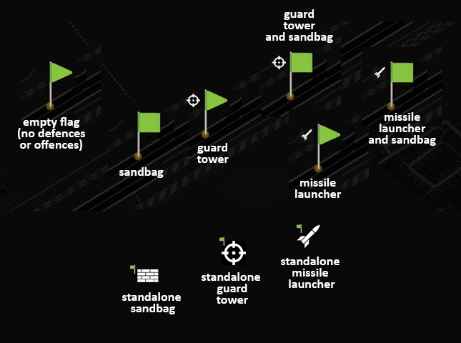
The new flags introduced in 2.0 are very large, way too large. Also, they comprise of two squares ("waving" flag) which, in crowded area, look like two separate flags, cluttering the screen. Suggestion 1: Simplify the flag The waving effect is not realy visible because the tone differences between the front and back (folding) side of the flag are very small. Perhaps we could resign from this effect completely? It's still a nice flag, but much clearer now. Suggestion 2: Use flag image to show sanboxes and turrents The UI shows us either flag or a building (sandbags, turret or missile launcher). This is quite inconsistent. On large areas, you end up with a mix of simple green elements (some flags) and rich colourful objects (resources, resource stations, flags with buidlings). I would like to suggest a following solution: for a flag, always use the flag; if there is a special building on a flag, show it using the flag (like a shape or an icon) instead of replacing the flag completely for standalone objects (missile launchers, turrents, sandbags) use a similar icon based on a different shape Example implementation: flags with sandbags are squares, without sandbags - triangles icon left to flag shows the offensive building standalone sandbags and offensive buildings use same icon/shape without flag, yet with smaller pixel-like flag to depict ownership (useful in dense areas and overlaping large lands) This itroduces some more information on the screen and may seem harder to new players, but I'd say the existing system is far more complicated (sometimes same icon is a flag, sometimes not, etc.). Now at least a flag is always a flag:

-

2.0 Readability and usability of the new UI list panels
Олег Поленин posted a topic in Technical Support
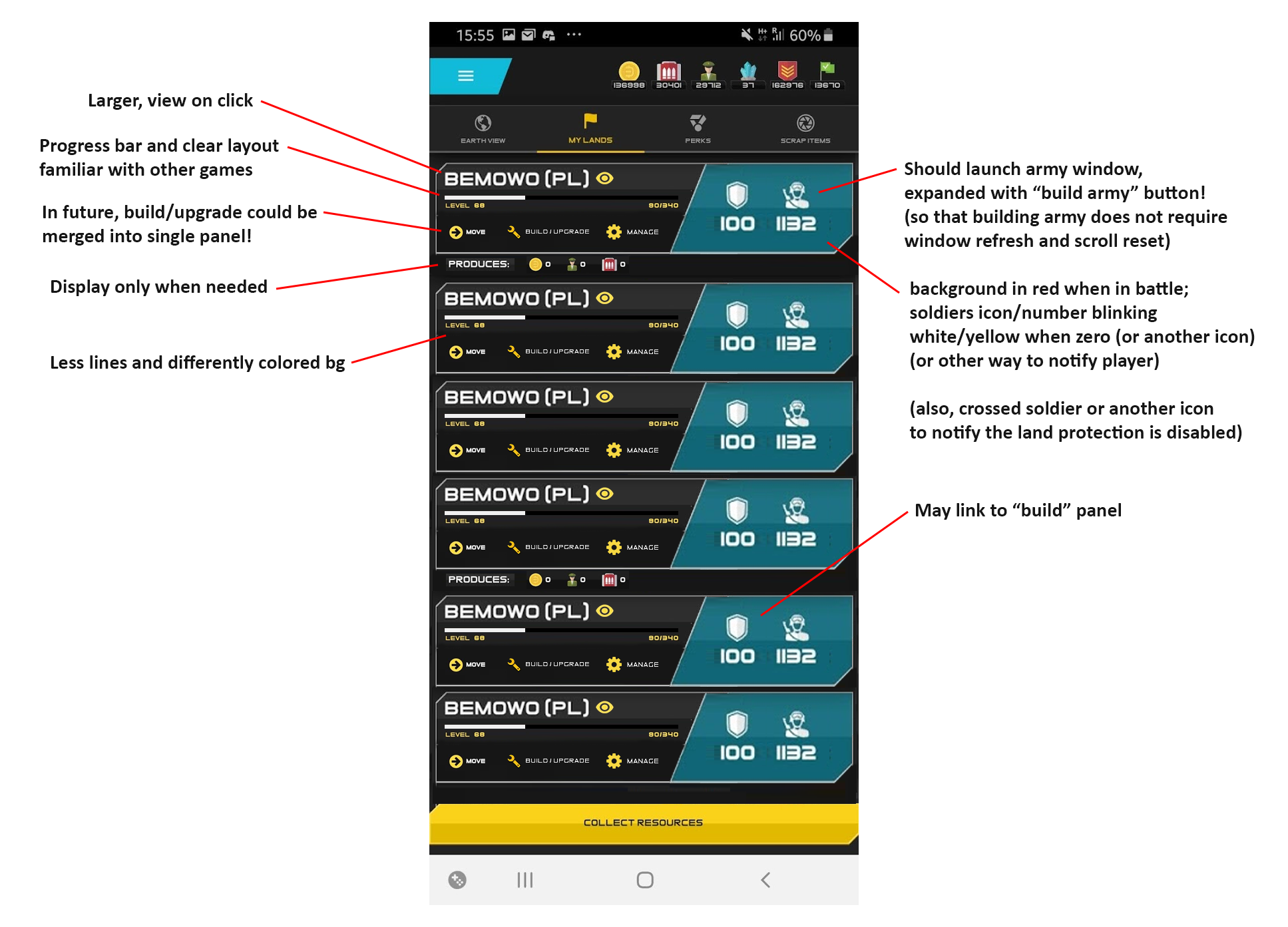
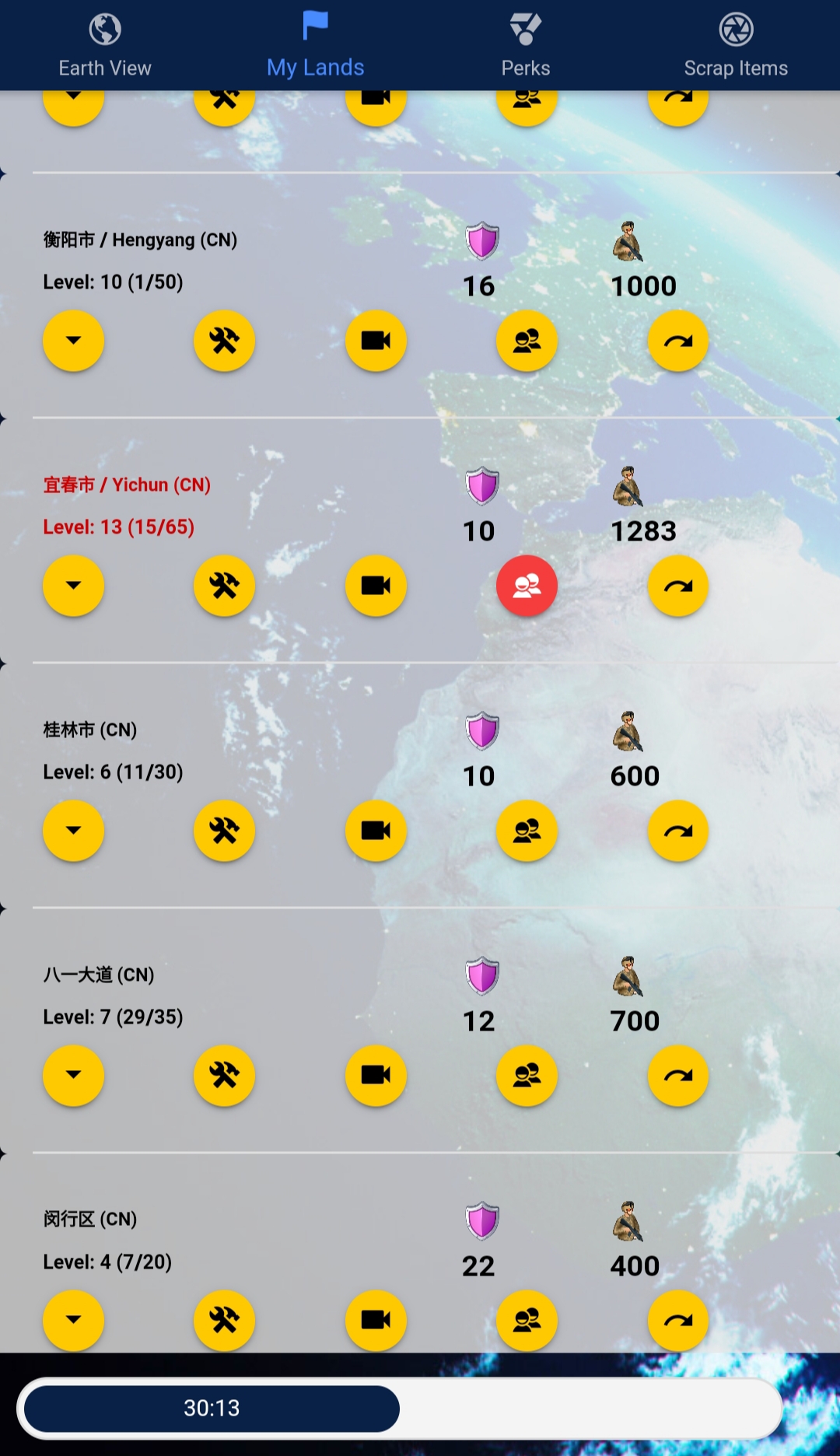
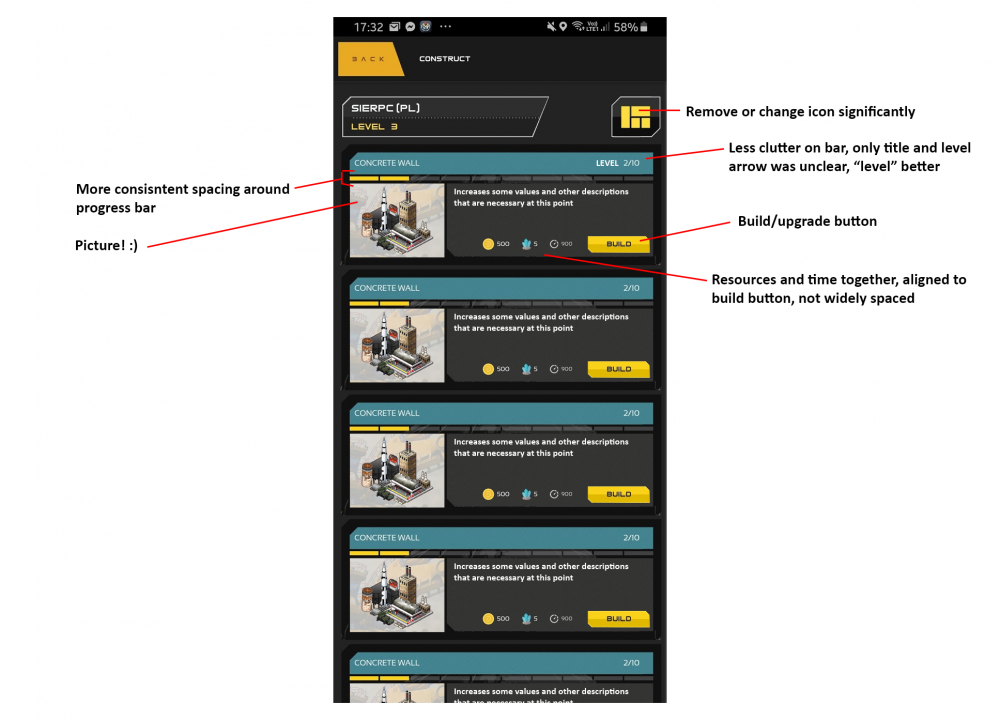
There are several panels in game that show information about a list of objects. The 2.0 update brought several updates to these panels, some of which improved the experience, while others, especially the graphic style, decreased their readability and usability. I'll make a general comment first and then will jump to specific panels directly: General comment There are two concepts introduced in new UI that, together, dramatically decrease the readability of various screens: the extreme use of various frames, borders, varying backgrounds, the ui paradigm further moving away from a tabelar/grid layout towards a chain of specialised UI boxes. These two together make it harder to find specific informations, or to quickly review them in a batch. I'll show exact examples below with change suggestions: My lands screen What was a single row of actions has now been split into two lines. It made the list longer and otherwise very cluttered. The middle row wastes a lot of space, and yet the icons feel kind of hidden, unimportant, or not even a button. It's now very hard to read through all the bases to inspect if they are not lacking in soldiers. The base name is lost in the clutter, due to the size and new font. The "produces" row: for 95% of gamers, or even more, this row will always show 0 on theirmain base and 99,99% it will show 0 on all bases that are not currently played in. It was far beter before, when it only showed values when they really existed. Suggestions: Messages screen Not much changed, but suggestions: time in same row as title, right-aligned (better position to compare and focus eye on in grid, less space); a way to quickly recongize message type (war, trade, alliance, share etc.) - perhaps an icon column to the left of the whole message block, or a small icon + color coding of the header background? smaller action buttons, in-box (so that user knows it's related) and bottom-right aligned Build screen "View details" totally not needed - contains 95% same info as already displayed (the only difference being defence/attack stats) resource cost very unclear due to items being spread along the row; lots of horizontal bars, again - hard to differentiate different blocks build time placed in quite a wrong place; building level in two unrelated locations; squares icon (to the right from base name) - I was even surprised it leads to anywhere; nor really clear; Suggestions: Edit: Trakced players screen This screen would also love an update to one-liners with two single buttons at the end. The player-specific "Track" button should be renamed to "Show" or "Show player", as the player is already tracked (misleading), also the same label is used for new players (so if we leave the first one "Track", perhaps this one should be "Add"?) The add new player button ("Track") is very small as it was before. Many new players have trouble noticing it. Perhaps a bigger, gold one should be used? (same for other similar screens, I assume)
-
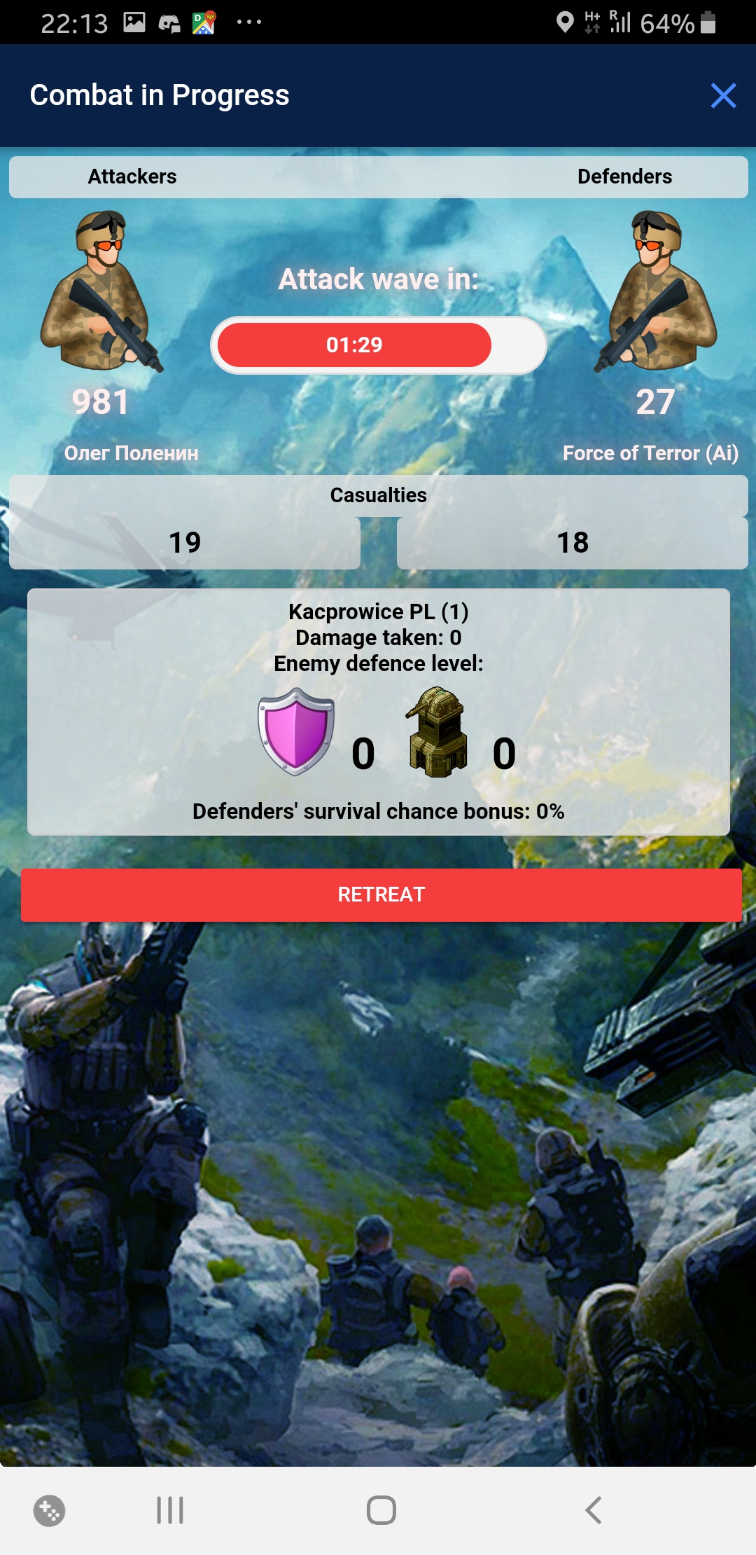
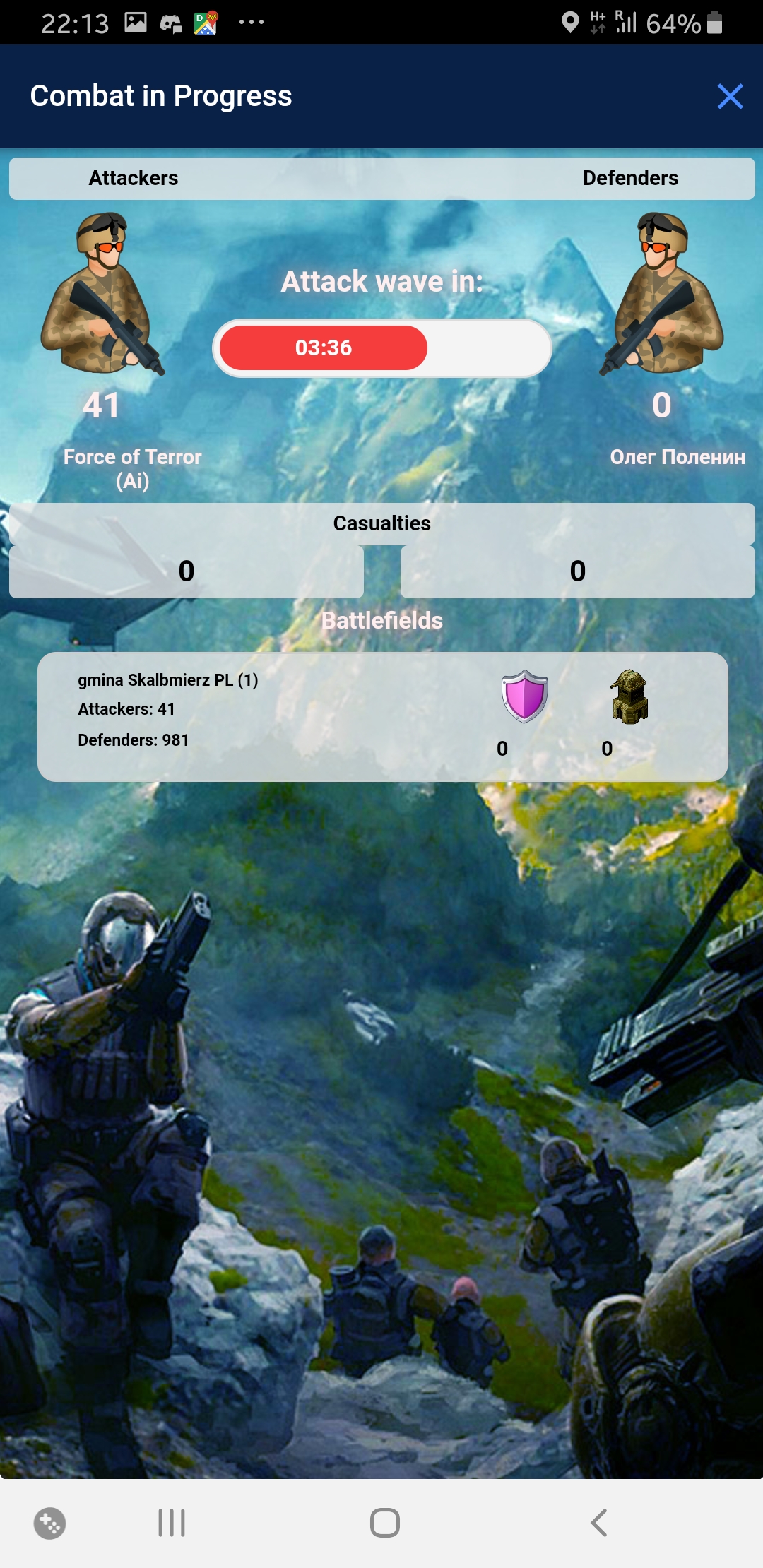
I'll write few smaller 2.0 issues in a single post, and then write about larger issues in separate post. bug: The Capture icon lost the background progress bar. Small font and low contrast added, it's very hard now to check remaining time, especially when on the move. bug: Binocs icon for regional stats is missing (does not appear on the map). bug: The new squarish font does incomplete unicode support. Certain polish diacritics are not supported (ł,ą,ę), which is weird, since I see others supported. bug: The resource icons disappear for a while, whenever one jumps into Earth View back from any tab. bug: The trade resource selector: once the value has been edited manually, pressing + and - buttons tends to concatenate "1" and "-1" strings to the end existing values instead of changing the value suggestion: The dark notice popup appears over the GPS button. Would work better if centered, so that it doesn't cover the icons on neither side. suggestion: Resource icons should link to resource purchase screens! (finding the UBT purchase screen is still hard!) suggestion: The TP resource icon is misleading, looks more like a land/land lv measure. This one needs something dedicated. suggestion: The bottom main UI buttons: once the capture button was moved to the bottom right corner, its really hard to hit with thumb when holding phone in a single hand, also, the spread variant looks worse than the previous one; I'd suggest to revert to the previous alignment (left-aligned) suggestion: The bottom main UI buttons: I liked circles more, but... if you use hex to make the design more interesting, perhaps try to use the fact, that these are hexagons, and try to align icons like the honeycomb? (screen) Update 2020-01-02 20:06 bug: the "rename" button is missing both from lands and from bases bug: the trackbar for attack wave begins ~20% filled bug: the attackers/defenders number is aligned left, should be centered Update 2020-01-02 20:24 bug: in the Perk tab, the popup box describing each perk is missing bottom border Update 2020-01-02 21:00 bug: the action buttons on the main screen have labels that are not localized suggestion: the font used for some elements has a very special rendering of lowercase letter k (looks like an R with a vertical line protruding upward), which makes it much less readable; if possible, I'd recommend a font with a less decoratve / more standarized rendering Update 2020-01-04 06:05 bug: the value pickers (trade, build army) ignore the input, ie.: open "build army", type any value, press "build", only one soldier will be built; open trade dialog, type any amount of resources and trade, button-set values will hold, manually typed values will zero. Update 2020-01-06 21:17 bug: while the building Upgrade button has been moved to the Construct screen and appears alternately with the Build button, this doesn't work correctly with lv100+ lands: the button always shows Build for making new instances of the building, but if a building already exists, there is no place for button to upgrade it; noticed by @Luna and [USSR] MaX Update 2020-01-07 22:41 bug: base points are not being added after the capture, or the My Lands screen is not properly updated, base points and base levels do not grow upon captures I will post new bugs in this main post.
-
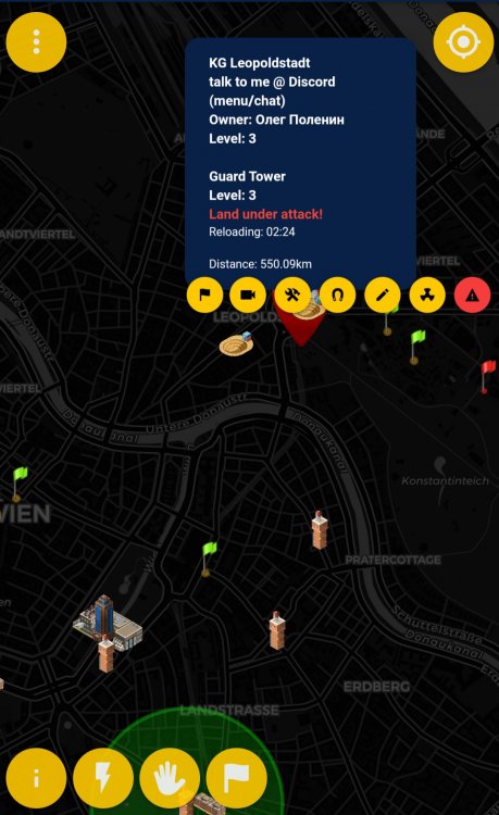
bug Base keeps defending old flags after being moved
Олег Поленин posted a topic in Technical Support
Here's what happened: Had an lv13 base in Vienna. Moved it to China during a train stop on some station I was padding by. Rebuilt the base in Vienna using remote capture. Grown it a bit with few merges to lv4. Old flag within this base got attacked. UI shown 1300 soldiers defending the flag. Vienna base shown no trace of being attacked. Found the Chinese base (former Vienna base) defends the flag in Vienna.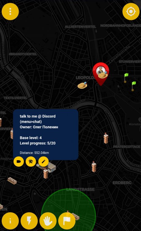

-
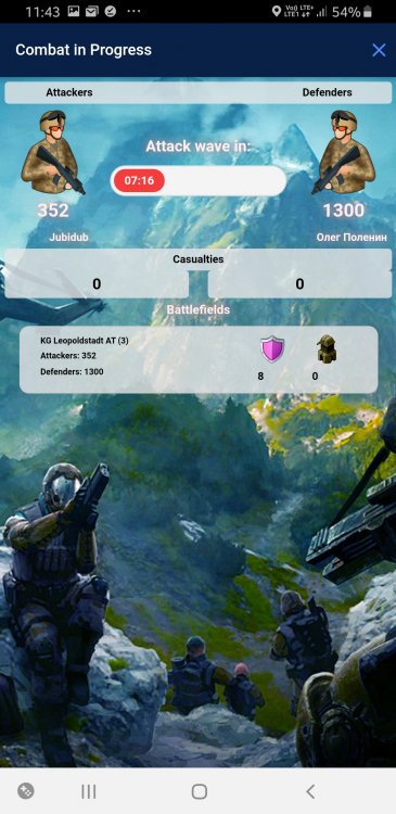
bug Attacked by FoT while attacking FoT: no defence
Олег Поленин posted a topic in Technical Support
I've attacked FoT while traveling. A little bit later captured a new lands and FoT attacked this land. All under a single base of mine, but likely, two separate bases of mine. Thus, single base was presented as both attacking and defending. The issue is, defending base displayed no defending troops. And once I have withdrawn the attack, defending base started showing defending troops correctly. This could be understandable if it were a rule, but I had my previous experiences as attacker against human players, when I did attack single base territories with two of my bases, and always the defending army fought against both my armies, only diminishing twice as fast as usual. Something's funny here.


-
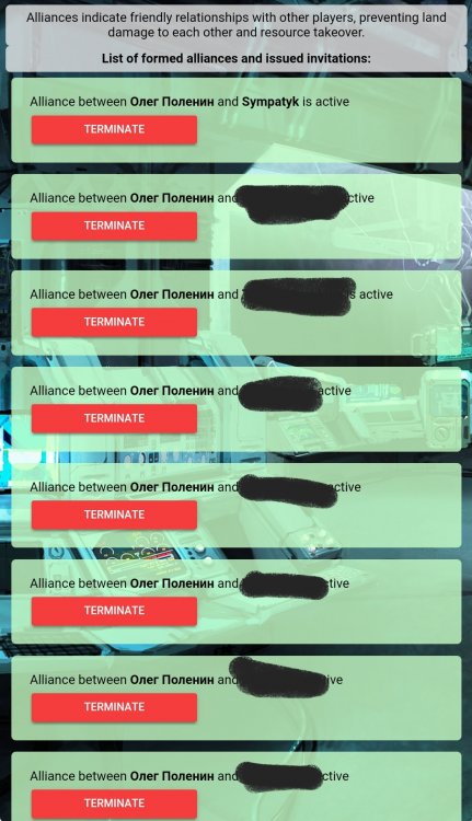
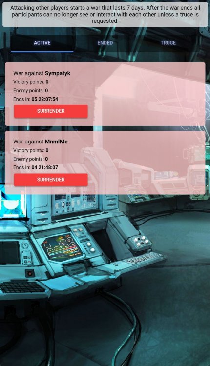
No idea how, no idea why. Just noticed this. Restarted the client and checked again. No contact with Sympatyk, so I don't really know what he did or how shall I respond
-
I must say that I thought moving servers down under would just add more latency to the existing lags... Well, wow! Nothing alike! The game is waaaay more responsive now. It's a huge improvement! Thanks!
-
Seems you'll be able to finalize the #brexit before Boris does Hope UK players won't be staying behind on the old server When are you planning to begin the procedure?
-
Alternatively, a top up button for each base on the base list would do pretty well too
-
That's the first idea I love Though I'd also suggest an opt-out checkbox at each base. I like to keep round numbers in leaderboards and filling all bases would ruin it.
-
FOT trubble with land without defences
Олег Поленин replied to Grizzlyfilms's topic in Technical Support
@Irrelevents The issue is, and I fully agree on it, that the UI should never allow submitting an empty form and charge UBT. It's clearly a bug. As for the sandbag/FoT issue, I'd also say the UI can be misleading. When FoT attacks an unprotected land, you still see the land, but when you click the battle icon, the screen shortly appears and then disappears with a "Battle has ended" message or something alike. I remember myself losing few lands until I got the grasp of the mechanics, that the land is still not taken and I can still fight. Though Grizz doesn't have much experience in putting his thought into writing, he sincerely brought to attention an important issue this time. (Grizz: sticking to one general subject per thread and less exclamations would improve your writing a bit!) -
FOT trubble with land without defences
Олег Поленин replied to Grizzlyfilms's topic in Technical Support
Yep. Even if the FoT attacks you right upon the land creation, you still have time enough to build a lv2 sandbag to let you survive the first wave. Another good trick to break the attacks (to not have to keep watch of the sandbags) is not to upgrade the land any further, but build a second one in the merging range. You then merge the attacked land into the new one. The attacked land disappears and the FoT cannot attack you for another hour -
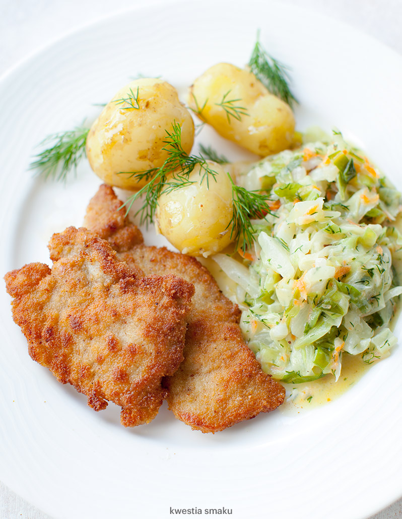
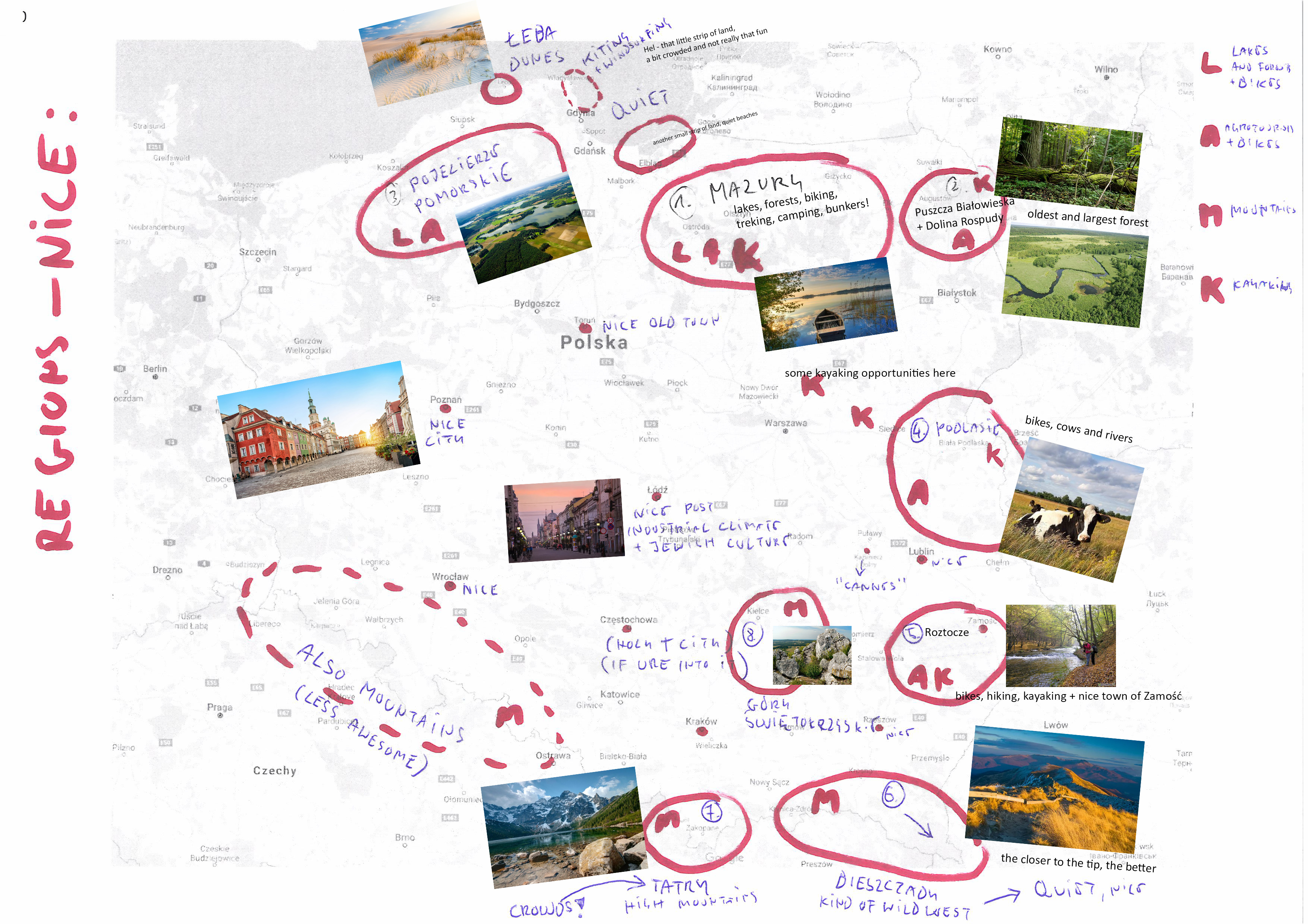
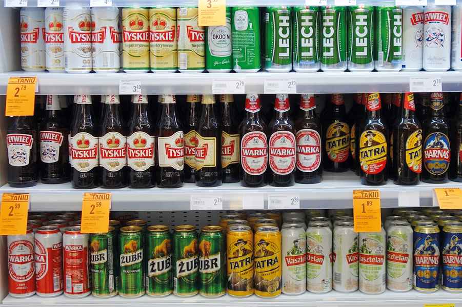
Culinary: Avoid mainstream brands of beer. This pics has most of them: You'll find many better beers from local breweries. Mainstream beers are seriously ill in poland. When crossing from Lithuania to polish Mazury, try some polish-lithuanian cousine: Kartacze - special type of potato bun with meat Sękacz - sweet cake of awesome shape There will be many "standard" polish dishes in many cheap bars, incl.: Kotlet Schabowy - breaded pork chop, like vienerschnitzel, but simpler Pierogi - dumplings with various fillings "De Volaille" - usually breaded chicken fillet rolled around butter or cheese Placki Ziemniaczane You'll also find a lot of pizzerias, kebabs and cheap vietnamese bars all around the country, even in smallest towns. Beware: The "kebab" name in poland is always used for shoarma/doner. Hard to tell why. Small and cheap vietnamese bars offer usually a very poor quality. Sometimes they call themselves "chinese", but the menu is usually the same. Generally check the menu. If it's very large and repetitive. Supposedly top polish fast food is "zapiekanka", a kind of bread-pizza with champignons or other toppings and an absurd amount of ketchup: Be aware that many polish restaurants put parsley or dill in all soups, meals, pastas etc. I find it grose. Ask in advance if you don't like it too Try polish cider. Market is slowly emerging, but we have the most awesome apples in europe


-
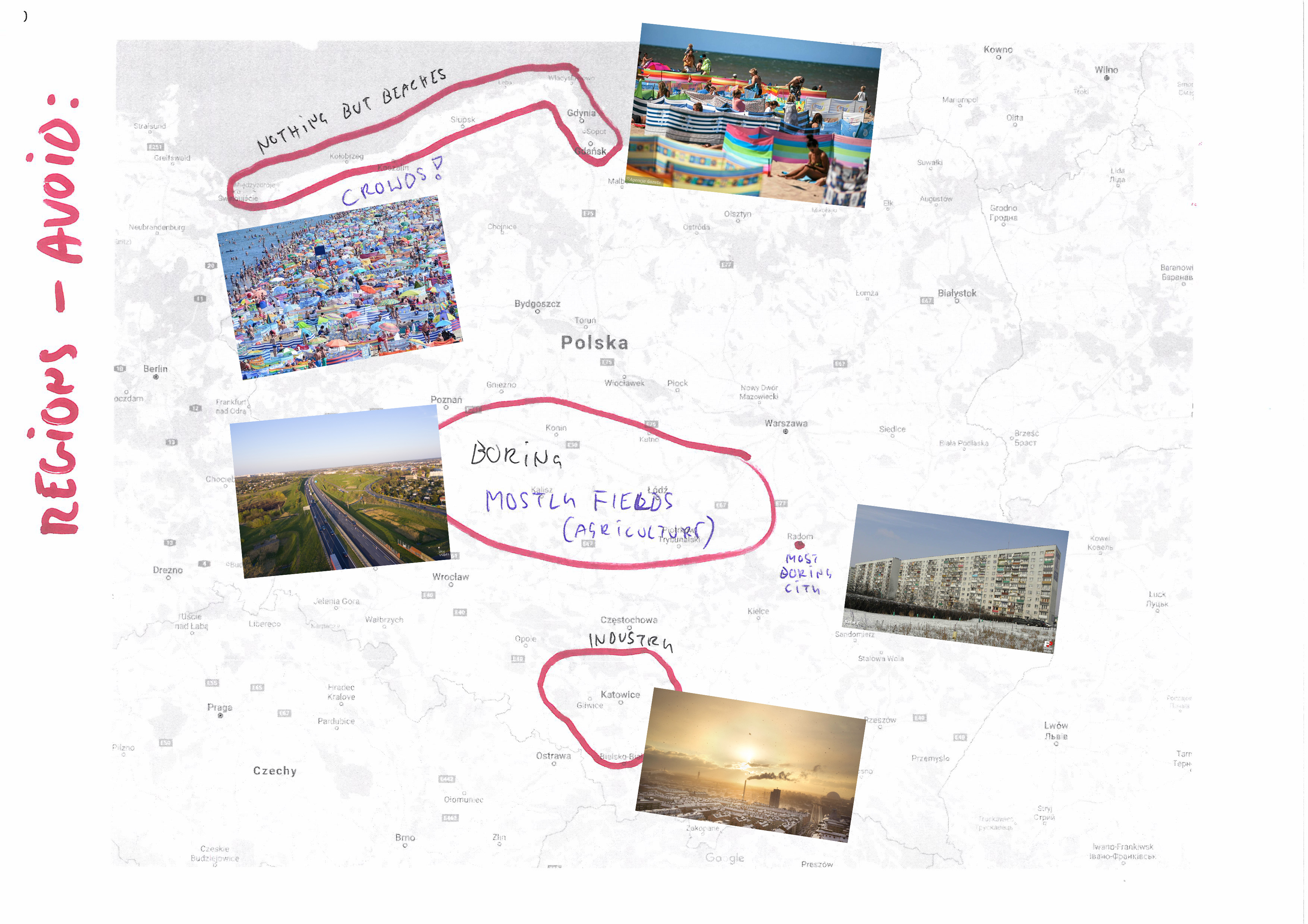
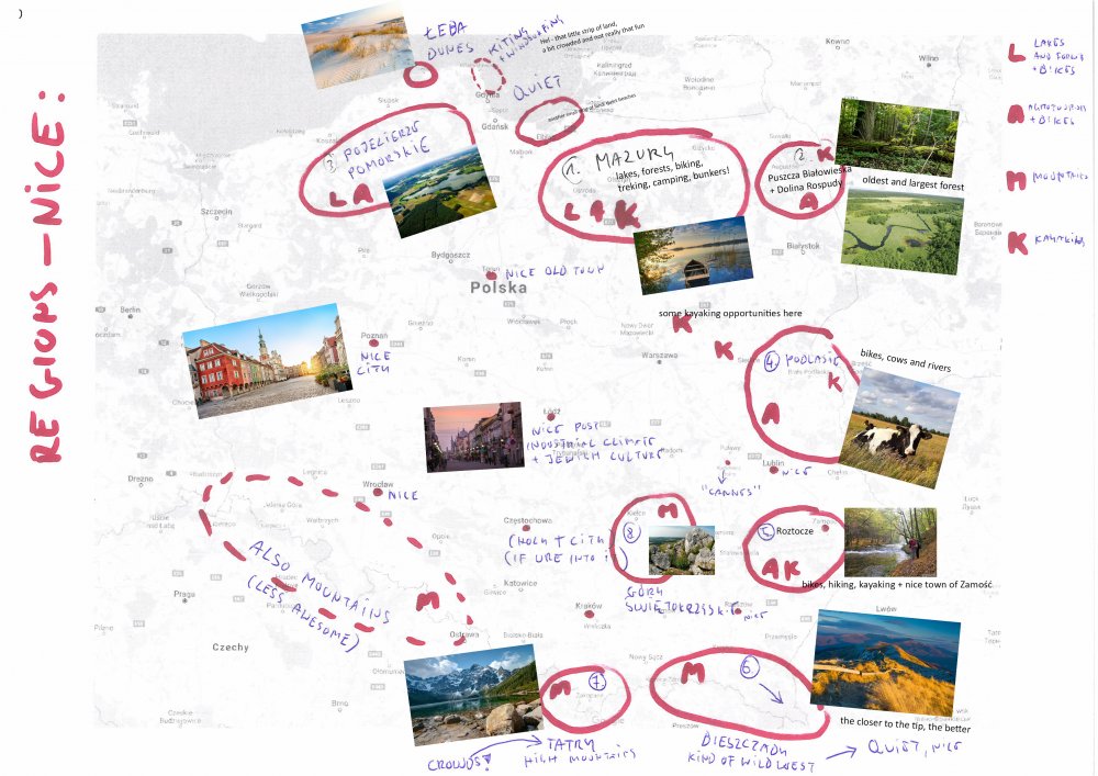
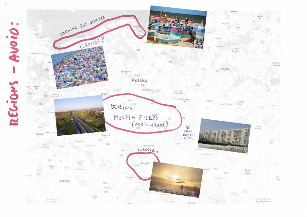
Do's: learn to read those few polish letters, will be usefull in reading town names and other directions (https://culture.pl/en/article/a-foreigners-guide-to-the-polish-alphabet) try polish cousine (more later) focus on the nature places; cites are same everywhere Dont's: avoid baltic sea, it's overcrowded during summer (two month school break), full of cheap (in style, not prices) bars and pubs and hotels, but otherwise nothing to do but sunbathing and swimming (if cyanobacterias are not blooming - ask lifeguards, as some people will be swimming regardless of any bans), unless you're a fan of lighthouses but truly, if you want Baltic, german shore is much more quiet and civilized, though sometimes even too much - few places are a bit geriatric avoid central Poland, it's mostly flat and boring; don't be a football fan when talking with young people that look like you don't want to talk with them about football or you might be astonished that polish fans you'll meet may know finnish league from the Helsingin Jalkapalloklubi down to a regional leagues, and that their polish footbal club has either a friendship pact with your city or, well, it might have not and you'll be in trouble; this ain't that much an issue nowadays, but still might be a rare issue. be carefull on the roads, lots of the main roads between cities are still single lined with lots of overtaking drivers, small villages and pedestrian crossings and intersections, panic braking before speed cameras etc.; we're still one of the top ranking countries in traffic accident statistics in europe. Others: tips are 10%, though not widely respected; rarely possible with a card cards are rather widely accepted, though the small shops and tourist accommodations in agricultural areas might accept cash only fuel quality is quite solid nowadays, still, avoid small fuel stations with unknown brands; the widely popular are Orlen, Circle K, BP and Shell; LPG is widely available
-
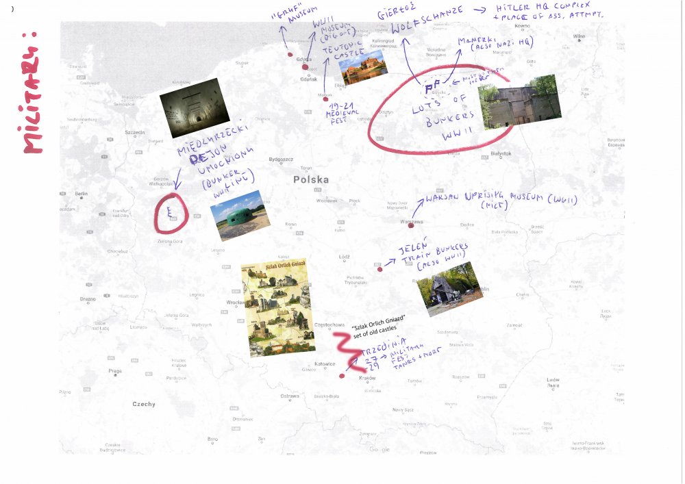
General regions with description: Military POI, mostly WWII: The "do-nots":
-
issue Problem with base sorting order
Олег Поленин replied to Олег Поленин's topic in Technical Support
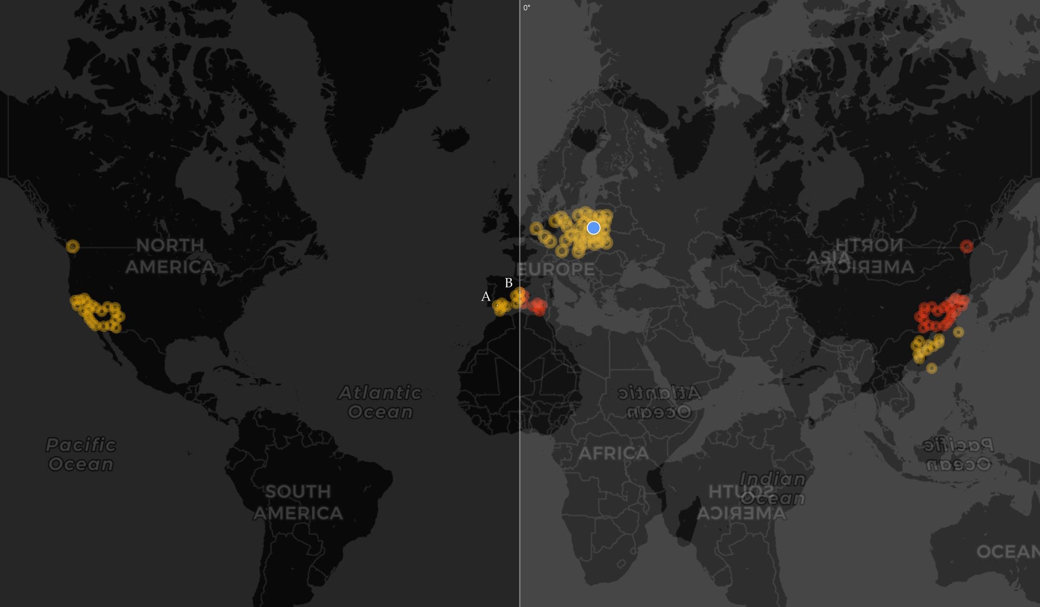
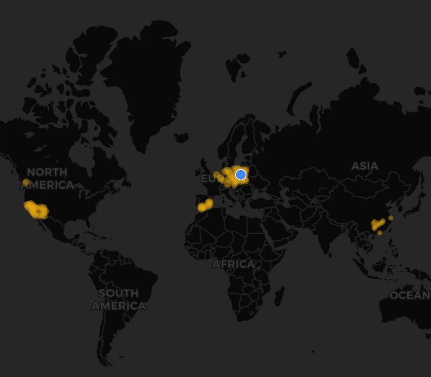
@Mr. D I have further found an even more solid proof that the problem is real - as well as the possible solution. At some point, somewhere in the code that calculates the arc distances for bases, the value of the longitude (and perhaps also latitude) becomes unsigned, ie. the information on whether the coordinate is in the western (W) or eastern (E) hemisphere is being lost. Thus, all coordinates are being applied on a single hemisphere and it distorts the order of bases. I've confirmed this by collecting the map of all my bases, and then overlaying the western hemisphere on eastern hemisphere - mirrored over prime (0°) meridian. The image below shows the result. The red bases are the "mirrored" ones. It now clearly answers the problem of US bases being displayed higher on list than Chinese ones, with few Chinese bases ending up in between US bases. It also explains something I've noticed earlier, but didn't put much investigation into it - that the base in Sevilla (A) is being displayed higher in list than the base in Castillon/Valencia (B). Q.E.D.
-
I've once had that problem. Never figured, were it some character or other rule. But changed the name to a simple one and then back again, though don't remember if identical. Try this yourself. Change the name to something else, best if something simple like one word, no spaces or special characters. Than, once successful, try again with your original desired name. Other than that, you may try to "track" the desired name to check if it's not already taken, this also might be a problem.
-
Has the name changed in Profile options, but not on actual lands? This happens, the new name take some to update on lands. If the Profile options still show old name, please tell if the blue "saving" bar appears on the top of the screen after clicking "save".
-
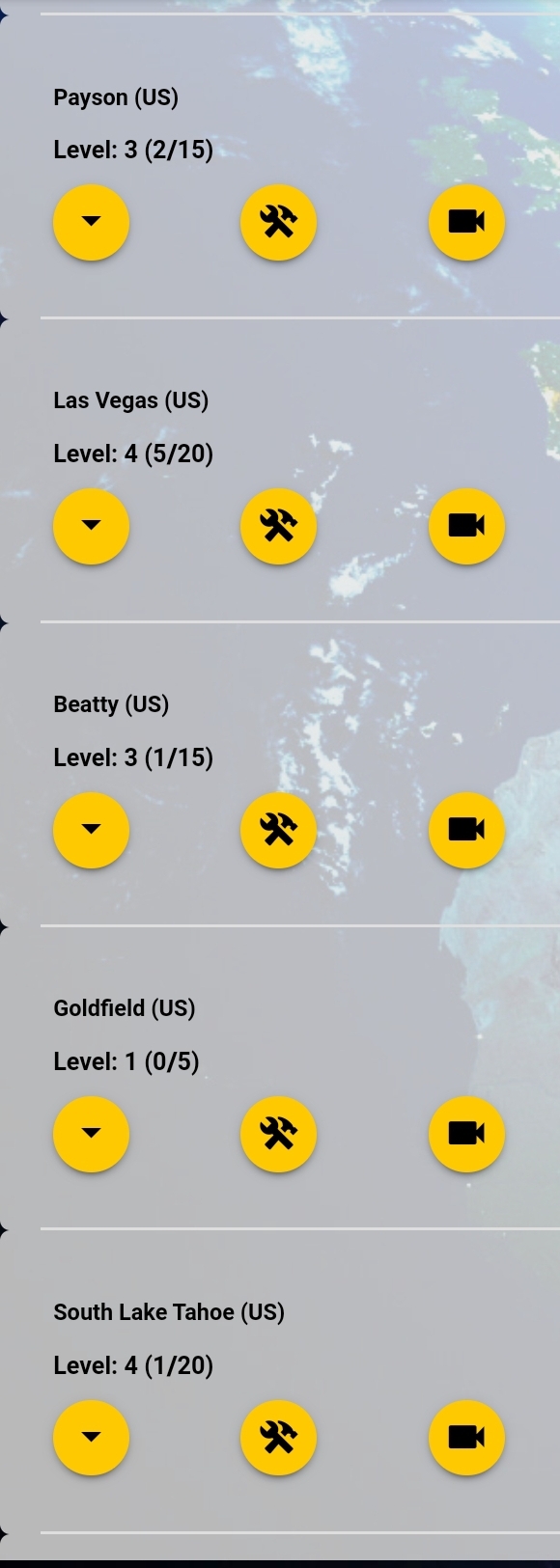
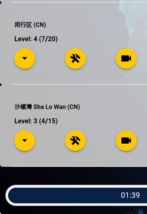
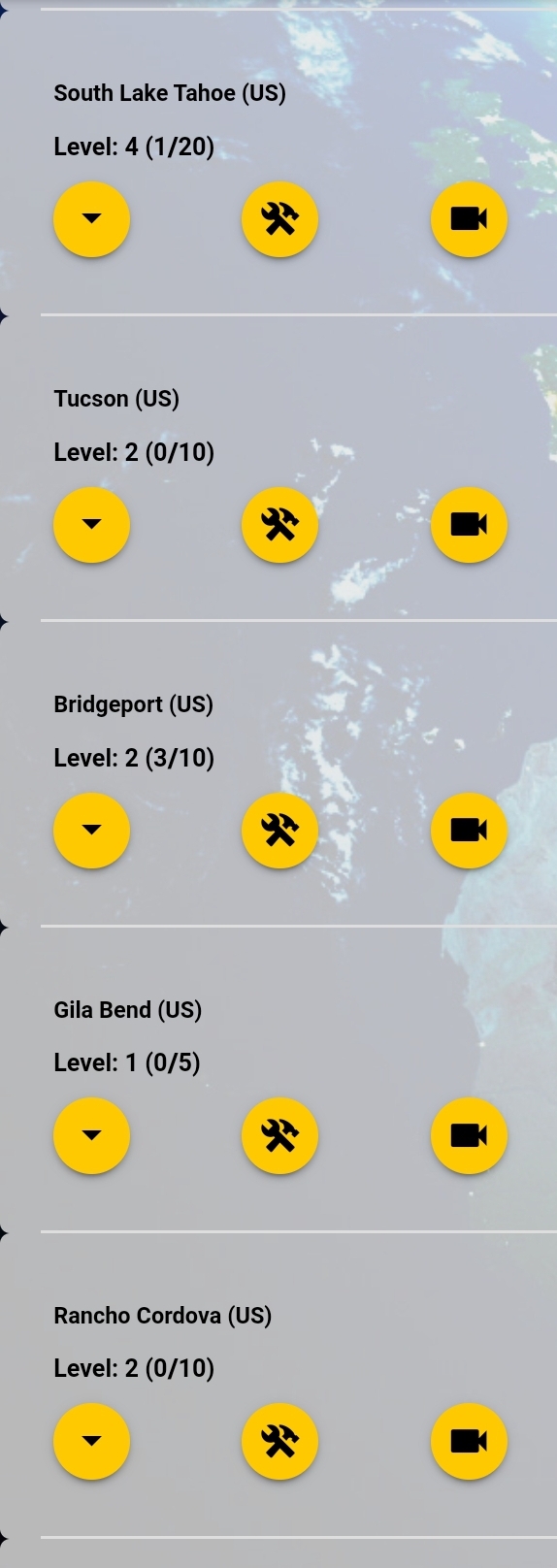
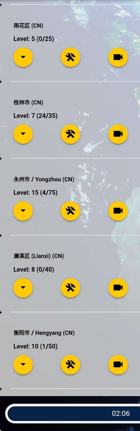
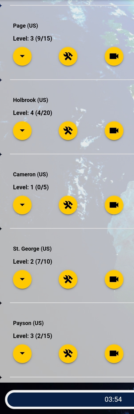
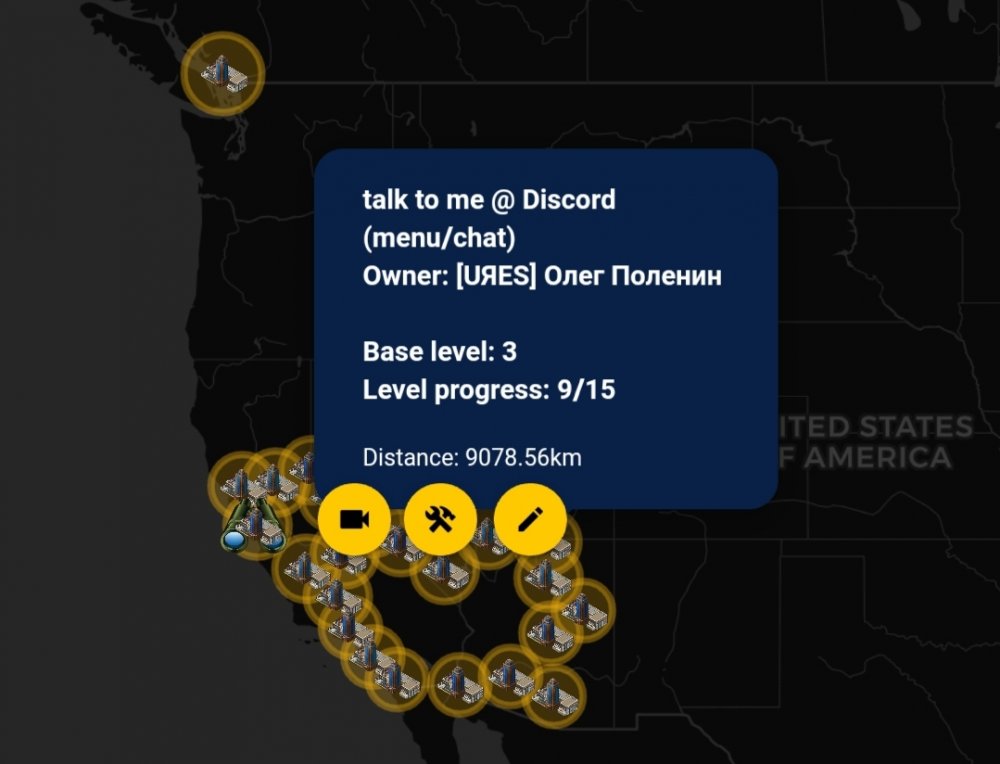
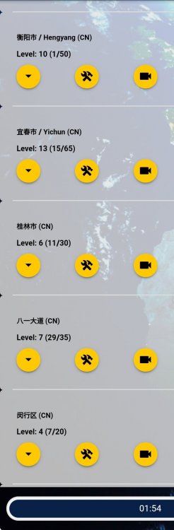
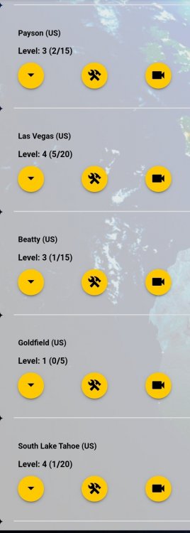
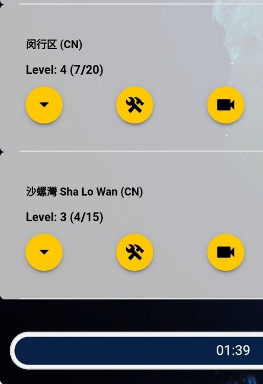
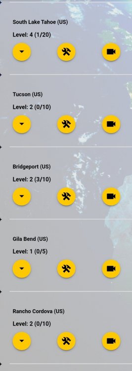
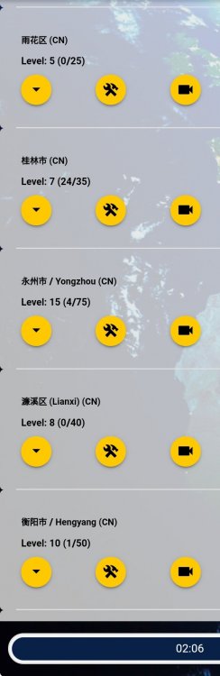
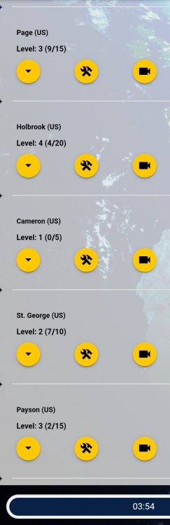
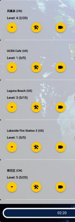
issue Problem with base sorting order
Олег Поленин replied to Олег Поленин's topic in Technical Support
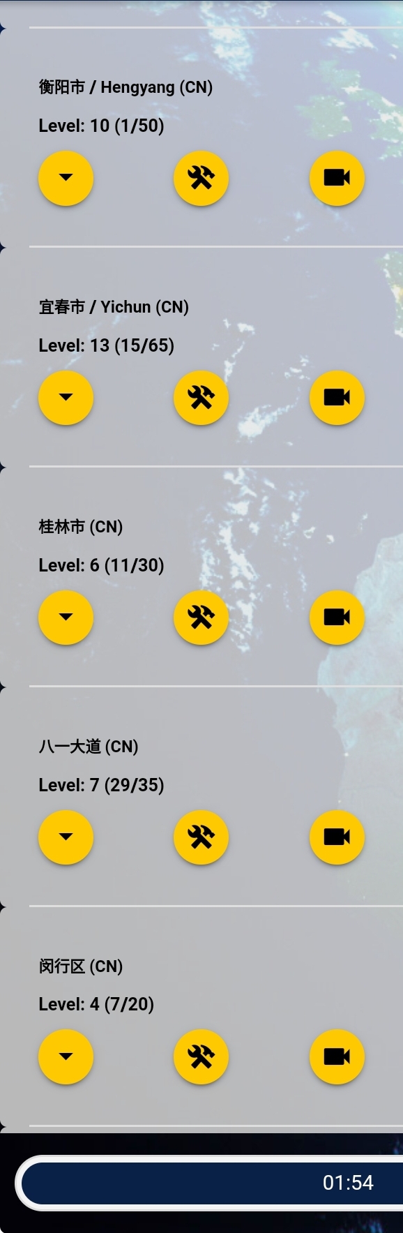
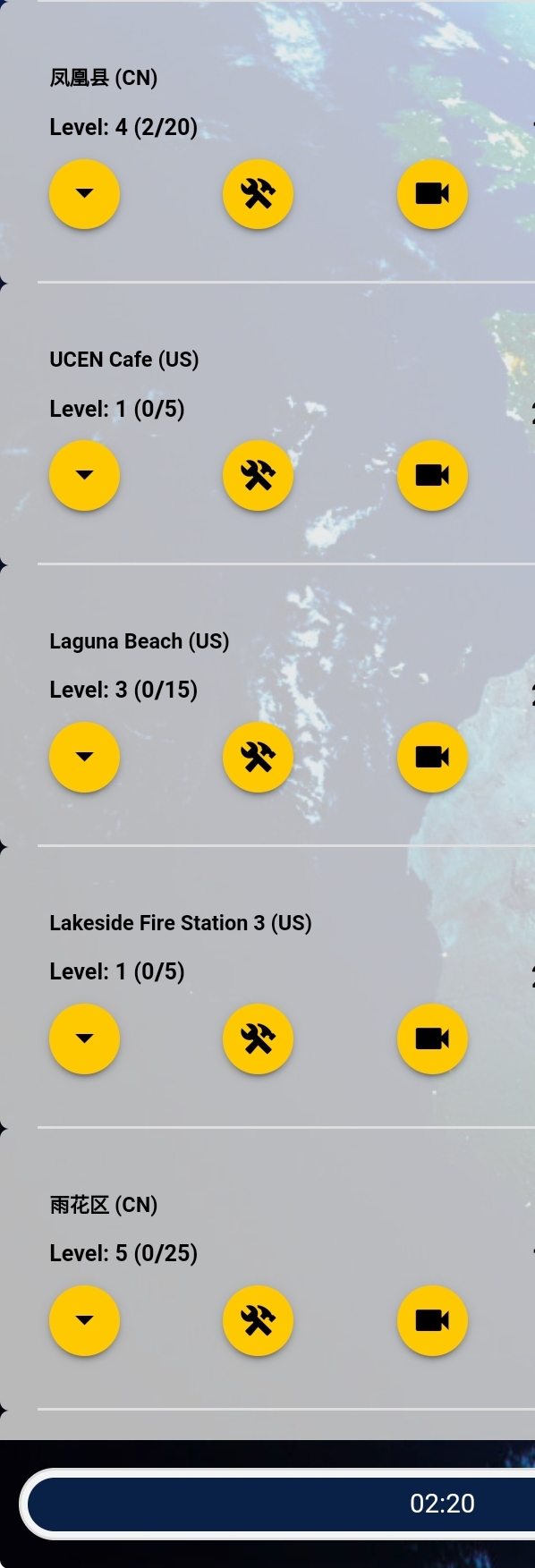
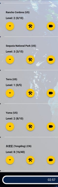
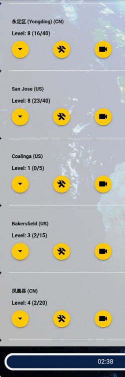
Came back home and checked again to exclude any doubts of suggested VPN related GPS issues. My US bases are now mostly placed before my China bases, with maybe two China bases interleaving in the rear of US stack. This proves without doubt that the problem indeed exists, as even the furthest Chinese base (Hongkong, 8265 km) is nearer to my location (Warsaw) than the nearest US base (Page, AZ, 9078 km) - and these values are from the game (though also confirmed via Google). And this should also be quite obvious when looking at the global map. The latitudes are similar, thus the great circle distances are generally relatable to the horizontal distance on the map: Even if you were to use some simplified geometry/math here (like a pitagorean out of latitude and longitude degree deltas), this should still not yeld such erroneous results. Screens from the game. Chinese bases are pretty well distinguishable: If this doesn't convince you, try to impersonate me on some test game environment with the location set anywhere in Warsaw. And, I'd like to repeat, it looked much more insane when in China, as some US bases actually interleaved the Chinese when listed from Chinese coordinates.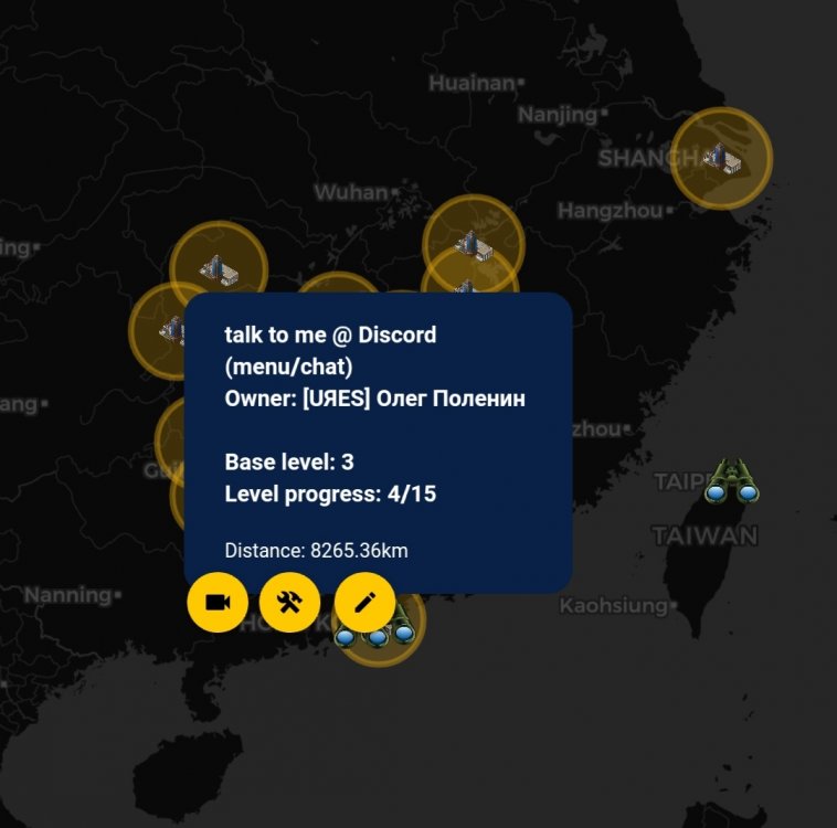
-
You can always find other player's land and offer the supplies. It will enable you to collect the surrounding ones, plus the FoT might help you get rid of the offered ones pretty fast